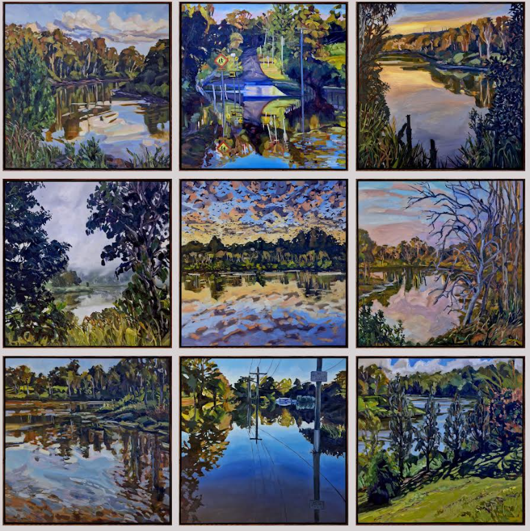
With an opening on 10 September 2015 at POP Gallery Woolloongabba, Indirect Response is a selection of new works by Simon Degroot PhD candidate at the Queensland College of Art. This exhibition is a chance for Degroot to display new painting and sculptural work that has emerged from his doctoral research thus far.
Degroot’s research interest is in the translation of formal elements in contemporary abstraction, tracing how and when shapes become reused, and from where they are sourced. To be able to investigate this he must speak many of the so-called ‘languages of art’; he must understand the logic of past aesthetics in order to apply his process of translation into contemporary abstraction. These recent works articulate the fluency with which he speaks these aesthetic languages.
A single black monochrome painting carries the exhibition’s title. Indirect Response recalls the modernist history of black monochromatic painting, such as the work of Kazimir Malevich or Ad Reinhardt. The idea of the black monochrome was presented in their art as a culmination and termination of the representational capability of art. Pictorial depth and verisimilitude of colour in painting were reduced to the two-dimensional surface of the canvas, signaling the end of the medium’s primacy as a representational art.
Of course, the self-professed dead end in the history of painting was nothing of the sort, and is better considered as more of a riddling hypothesis on the nature of the art. As a work, Indirect Response provides a useful gateway between the colourful works and monochromatic green paintings in the exhibition. Its shades of black make it evocative of a photocopy of one or a combination of other exhibited works, which Degroot notes was a conscious decision throughout the artistic process. In effect Degroot is trying to mirror the way that photocopies are always at once originals and copies of something that exists outside of themselves. (1)
The understanding of how to make paintings that are both original and reiterative of something else is present throughout the exhibition. As a PhD candidate, the depth of his research means his work must knowingly take onboard the impossibility of undoing the Modernist monochrome. He must work ‘in direct response’ to the black monochrome, photocopying and displaying these problems in order to keep them present. And yet Degroot must also translate these problems into new and contemporary terms – define the parameters – to propel them forward.
This exhibition is an exciting achievement in Degroot’s practice. Essentially he has used his own language, created a personal lexicon in taking on the inveterate painterly, abstract conundrums of the 20th century. The voice that Degroot embodies in paint on canvas is one attenuated by a dauntless personally private tone – refreshingly revealing for an abstract artist. The works throughout this exhibition are aesthetically bold and determined, without the detached and impersonal veneer commonly found in abstraction.
All the works in Indirect Response display large, simple, bold, and emphatic shapes, applied in veiling layers of drastically thinned oil paint, which behaves and appears ink-like in its transparency. The sharp edges around his shapes are vocal and purposeful, visually emphasizing their curves and angles.
Composite Orders, the collective title of the green monochromes, is a term originating in the study of architecture to describe a method of hybridising elements from distinct precepts of design, called orders. A composite order is an amalgam of elements; a synthetic combination of aesthetic characteristics from distinct places organised in a manner which allows those elements to build atop each other while keeping their origins visible.
As noted, the order of ‘abstraction in Western art’ is evidenced through Degroot’s direct reiterations of constructed environments. However, this language is translated through orders emanating from the artist’s lived experience. One, unlikely, example, is the built environment in Road Runner cartoons. The especially cartoony nature of the man-made products and environments – such as the extreme curvatures of bridges, or the exaggerated shapes of the prototypical Acme anvil – are familiar as a result of their unusualness. Degroot cites commercial logos as another example.
These orders also influence ways of seeing and understanding the world. Looking upon the world in the order of ‘cartoony representation’, he flattens the depth of the horizon into distinct layers. As a consequence, the environment is filled with negative spaces, like the 2D shape created between buildings that may be a kilometer apart. Scrutinising and decontextualising these shapes probes their importance to the built environment. Looking this way creates a familiar double of the world. This order of ‘shape motifs’ appear frequently throughout this body of work.
Colour is used by Degroot to highlight an amalgam of orders and sets in motion a distinct resonance between the works. The multi-coloured works echo the pastels of the Road Runner animations, whilst the black monochrome recalls traditions of western abstraction. By contrast, Degroot aligns the shade of green found in Composite Orders, to that found in early computer and supermarket checkout screens. By leaving the white canvas visible around the border of the works, these green monochromes seem to be backlit like the computer screens they are inspired by. They have a luminous quality that pushes the veiled layers of paint forward from the canvas, the opposite of the photographic depths of the black monochrome.
Combined, the familiar but slightly obscure body of work creates a clear and expressive invitation to see the world in terms of orders. Degroot’s intelligent and attractive paintings illustrate how a range of influences and research interests can be translated and expressed in direct response to one’s environment and experiences.
Indirect Response translates and repeats the world into a synthesis of inventive painterly language. Degroot retains the dense history of abstraction in these works, however the transparency of these paintings allows the viewer to visually pass in and out (and eventually through) the static, impenetrable idea of the monochrome.
Written by Cameron Hope
(1) Simon Degroot, interview with S. Marsh and C. Hope (Brisbane, 7 August 2015).
From the exhibition ‘Indirect Response’ by Simon Degroot @ POP Gallery
Image: Simon Degroot Indirect Response 2015, oil on canvas, 120 x 137cm