In an art world marked by big business sponsors and French champagne it is refreshing to see the kind of bottom–up show like PINKING. Held in residential West End, Cut Thumb gives an enthusiastic, share-house support to young artists. Indeed, a light-hearted, art-for-arts-sake sensibility cuts cross the whole of Rachael Archibald’s practice.
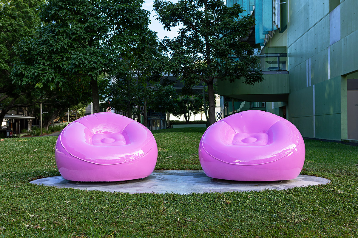
There is a gentle irony then as Archibald creates non-commercial, non-orthodox art yet with a “decorative edge”. The tension between categories of high and low art, Avant Garde-ism and décor is brought to life in the two lenticular prints: images with the illusion of movement as one shifts their gaze upon it. The lenticular is a gimmicky medium, if we were even to call it that: its label is toy, not masterpiece. And yet Archibald superimposes three images of abstract, intricately textured and voluminous forms onto the surface. So when we shift across the lenticular, rather than see eyes pop out of a cartoon character or a lions mouth open in a roar, we are faced with an interlacing of pink landscapes and the appearance of letters P I N K I N G. How do we react? We can no longer think of the lenticular as child’s entertainment because here it appears so ethereal.
This really leads us to Archibald’s primary practice of digital art; and how the digital is seemingly locked in a binary opposition to Art. Archibald is often asked if she works within the vaporwave movement, which she has denied[1]. I think, if anything, Archibald does not work under vaporwave but against it. The “joke” in vaporwave is the flatness. The creators are using 90’s computer graphics precisely because they subvert aesthetics; they are “ugly” and so overtly not art. Archibald’s work is nothing like this. The forms in her digital images are not angsty but earnest. She is bringing the texture and movement already established in “high art” to the scroll up scroll down gallery wall of the Internet.
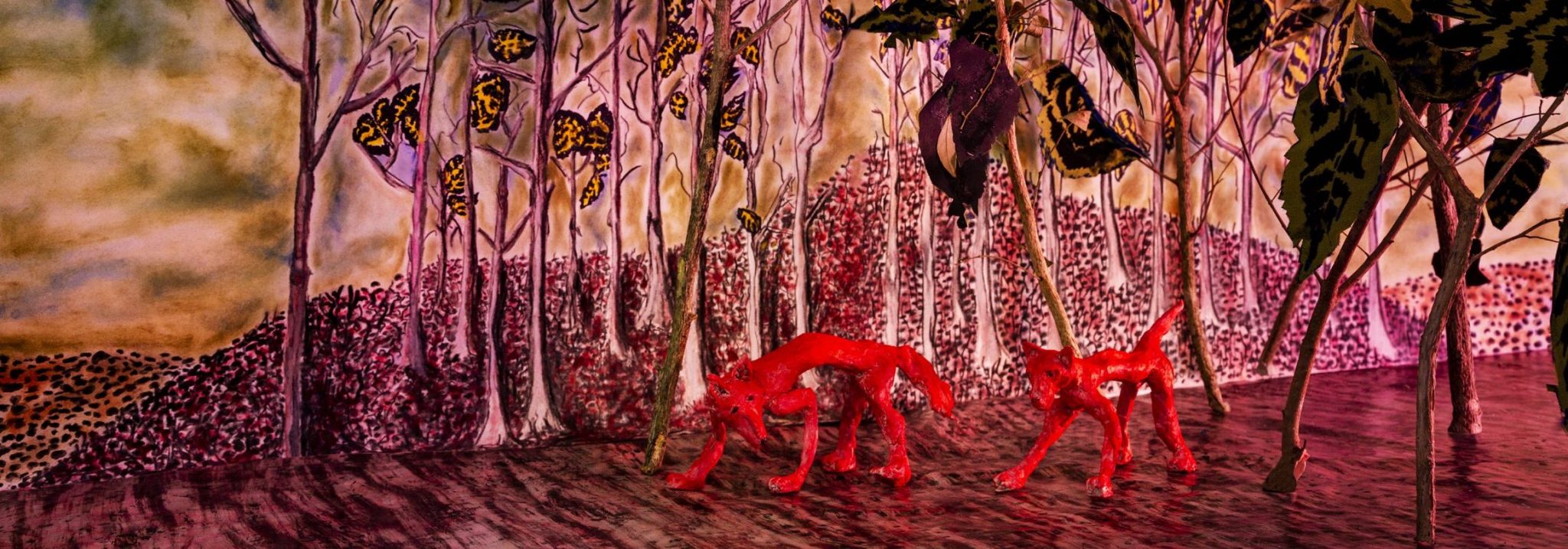
Establishing what Archibald is not, we might realise she is in fact closer to the past then on first glance. Both framing the show and forming its focal point is the large projection of a moving digital image. The projection may initially appear like a pink stream running across the screen. But layered above the glass-like swirls are patches of a more textured and metallic surface. And so these aluminium scabs disrupt the flow. The projection is in fact more like an extreme close up of her previous rock forms. The image is something like a spinning planet: tectonic plates resting above a molten centre. If we think about Archibald’s work in this way then she falls not so much into the camp of form but into that other, side-lined thread in art history of surface. Archibald liberates surface from its form. The metallic, the liquid and the plastic all exist in the work but are not limited to any one object; that is to say, this is not a collection of metal, liquid or plastic objects but a collection of metal, liquid and plastic essences, surfaces. Much like those strange images by Hieronymus Bosch or the crowed scenes of Robert Campin, the reality of Archibald’s work lies in its texture.
Archibald’s work then seems at once strikingly new and strangely familiar. The mediums of her works confront. However, as our eyes adjust to digital we can see underlying the new is an age-old pursuit for tangibility.
Written by Sophie Rose
[1] Interview with Saskia Edwards. Aesthetic Fixation, 19 April 2014.
Image: Poem by Callum Galletly
From the exhibition: PINKING. Decorative. Edge. by Rachael Archibald (28 November 2015). Courtesy of Cut Thumb ARI

